
Content design: revising the 'Simply Safe and Suitable Template Food Control Plan'
October 2021 to December 2023
Key info
Core team size
Food safety advisor/project lead, visual designer (part time), food subject matter expert (part time), service designer
My role
Service designer
Tools used
-
Adobe InDesign
-
Survey Monkey
-
Excel
-
Miro
Skills
-
Interviewing
-
Developing interview questions
-
Analysing interview data
-
Developing personas
-
Online and in-person ideation
-
One-on-one user testing
-
Survey writing
-
Writing user communications
-
Training others on user testing
Quick facts
-
Interviewed 30 users to identify pain points with Simply Safe and Suitable template food control plan
-
Key pain points - users not understanding complex concepts
-
Developed and tested better ways to explain complex concepts with users
-
Complex concepts were better understood by the majority users


Project goal
The project aims to ensure that all content in the templates is technically and legally correct, accessible, and easy for food business operators to use. The scope of the project was limited to amending these templates themselves rather any supporting services and materials.
Background
There are 5 main templates ('the templates') provided under the Food Act 2014 by New Zealand Food Safety (NZFS) at Ministry for Primary Industries (MPI):
-
the Simply Safe and Suitable (SSS) template food control plan
-
My Food Plan
-
National Programme guidance documents 1, 2, and 3
These templates were created using a design thinking approach in 2016 and required an update. These templates are used by approximately 36,000 food businesses (i.e., customers or users) to help them comply with food safety laws. These are written in plain English. Verifiers (i.e., auditors) verify food businesses against these templates.
For the purpose of this case study, I will talk about the SSS only.
What we did
Discover
-
I interviewed approximately 30 people with various roles in the food industry to identify where the templates could be improved.
-
We requested and received written feedback from about 13 verifier agencies on the templates.
-
I gathered persona information such as learning styles, communication preferences, educational background.
Define
-
I analysed feedback and interview data
-
I identified insights and pain points with current templates
-
We identified that customers generally liked the the layout, look and feel of their template and found it easy to follow for the most part
Findings
Pain points included:
-
-
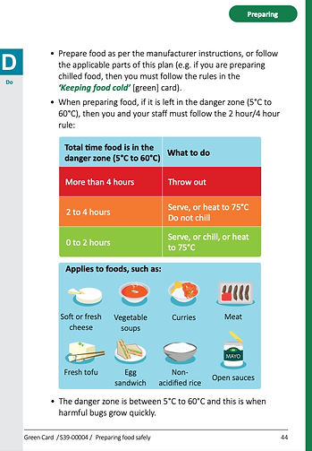
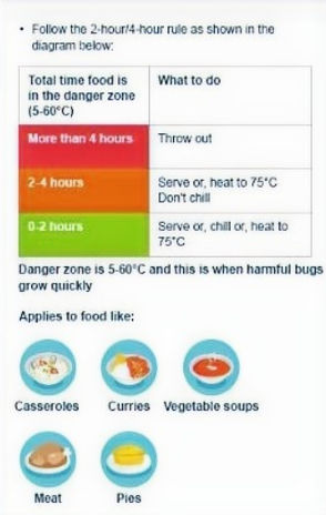
difficulty understanding complex information (for example, 2-hour/4-hour and cooling rules),
-
difficulty understanding some of the terminology,
-
finding the cooling method impractical,
-
difficulty navigating the plan,
-
difficulty accessing supporting information,
-
difficulty managing record keeping requirements and knowing what information to record.
-
-
I created personas from the interview data.
Develop
Generating and testing ideas
-
I turned pain points into how might we statements to inform ideation.
-
I planned and facilitated ideation sessions with internal stakeholders, food businesses and verifiers to resolve in scope pain points identified during 'Define'. Used a mix of online real time and asynchronous sessions to gather ideas to resolve pain points.
-
The ideation sessions included the following how might we's (HMW):
-
how might we make the 2-hour/4-hour rule easier to understand
-
how might we make the cooling method easier to understand
-
-
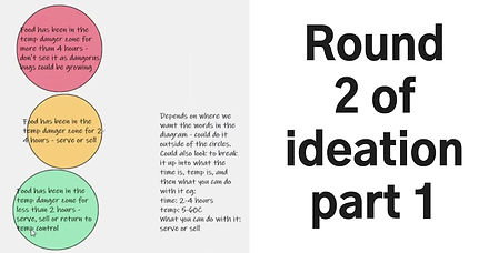
Below is a video clip of the ideas generated from round 1 to resolve HMW1 and HMW2
-
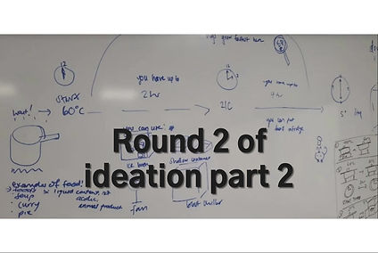
We further developed the ideas from round 1 in round 2, as per below. Ideas are in video related to HMW1 and HMW2.
-
These ideas were then developed further by myself and a visual designer. Examples of these are below.
-
We tested these ideas (below) with 21 customers. across all persona types in online and in person one-on-one user tests Identified that ideas shown below did particularly well.
I found that users understood traffic light colour and found it easier to understand visuals that showed the full picture were better understood
-
Held three online feedback sessions with verifiers representing most agencies across the country
-
Used test results and feedback to refine the ideas. These refined ideas (shown below) were tested via a survey with customers and verifiers. The survey was sent to representative sample of the population group. We found the following:
-
approximately 70% said that the proposed visual explanations of the cooling process and 2-hour/4-hour rule were very clear or extremely clear.
-
-
We re-worked written content using readability tools to make content easier to understand
-
We presented proposed changes to the templates on our website for a public consultation. Contacted interested parties by multiple channels to ensure that they have a chance to give feedback.
-
We revised the templates (including the cooling and 2-hour/4-hour rule diagrams) as appropriate using the submissions, user test survey data, and best practices to improve accessibility.
Simply Safe & Suitable features
-
I recommended and implemented the following accessibility changes with the assistance of the team
-
QR codes;
-
providing a low ink/printer friendly version;
-
making it clearer that the templates can be used electronically;
-
increasing typeface size and font size for readability;
-
changing colours to improve readability ;
-
including visual explanations for difficult concepts;
-
rewriting content in plain English;
-
clarifying meanings of contentious terminology.
-
Preparing for delivery
-
I used the HEART assessment to determine what metrics to measure
-
I created surveys to measure success
-
We worked with engagement and communications advisers to create a plan to make sure that customers and verifiers are aware of the updates to the plans, what the changes are and what they need to do.
Deliver
-
The updated SSS was published in May 2023. It can be found on the NZFS website.
-
I wrote the email content on the updated SSS and had this emailed to participants and businesses registered with MPI
-
Verifiers across the country were invited to webinars on the updates and advised to update the businesses registered with them. I co-wrote the webinar content.
-
I organised the printing of the templates. Verifiers were provided with free copies of the template to give to food businesses.
-
I wrote the website & social media updates. The updates were implemented by our public affairs teams.
-
I wrote updates on the templates in an e-newsletter to verifiers and food businesses
Measuring success
-
I distributed surveys to measure success to identify whether:
-
Customers have a good understanding of complex concepts (for example, 2 hour/4 hour rule and cooling method)
-
Good understanding of terminology
-
-
Surveys to be re-distributed after the transition date 20 February 2024
-
Other metrics to collect includes:
-
verification data to identify whether customers have better food safety verification 'audit' outcomes particularly around record keeping, cooling food, and storing food at the correct temperature (relates to the 2-hour/4-hour rule).
-
verification data to identify whether businesses are using the new version of the template
-
Impact
-
Users have commented that they find the QR codes useful
-
Users have commented that the cooling diagram is very helpful
-
80% found the new cooling diagram easy or very easy to understand
-
82% found the new 2-hour/4-hour rule diagram easy or very easy to understand
-
Users said that this iteration is the most straight forward version of the template
Lessons learnt
-
Asynchronous online ideation was poor choice of method for our end users. I found that it is better to call a number of people and guide them through ideation in real time. Unguided ideation did work fairly well with verifiers and internal stakeholders.
-
The data from 30 interviews was almost unmanageable for our small team and for one person to transcribe the interviews as there was a lot of notes that needed transcribing.
Concepts from the first round of a virtual ideation session
Concepts from the second round of a virtual ideation session
Personas developed as part of the project